The@title sentinel ties a link’s text to its target’s current title at build time: Testing Site Features renders this page’s title, and Header 4 renders the current text of the “Header 4” section.
A quote whose title is an@title fill: the live title renders with plain acronyms.
The Basic Reasons I Expect AGI Ruin
A plain-text title-cased quote title: “agi” stays plain.
Does Proton VPN keep logs?
A prose quote title: “vpn” is small-capped as usual.
In-text work titles behave the same way: a title-cased link like Seeking Power is Often Convergently Instrumental in MDPs and an italicized title like Corrigibility Can Be VNM-Incoherent keep their acronyms as plain caps, while prose mentions of nasa, a lone italicized llm, and sentence-cased links like how the fbi does its work stay small-capped.
Hi! I’mTurnTrout, but the United States government insists on calling me “Alexander Matt Turner.” I like writing about lots of stuff and learning about lots of stuff. For more about my professional life, check out my research.
Quote
Hi! Am I being transcluded? Here is a within-page link to the admonitions section; because this section is transcluded from the same page above, both copies stay within-page links.
Lede transclusion, which stops at the first subheading and so leaves out the nested subsection:
This lede is the only part of the section which the lede transclusion picks up.
Hi! Am I being transcluded? Here is a within-page link to the admonitions section; because this section is transcluded from the same page above, both copies stay within-page links.
This word is solongitmightendupoverflowingornotwrappingiftheconfigurationiswrong.
Math
Note
The content of both the nested and non-nested “note” admonition.
Quote
A man may take to drink because he feels himself to be a failure, and then fail all the more completely because he drinks. It is rather the same thing that is happening to the English language. It becomes ugly and inaccurate because our thoughts are foolish, but the slovenliness of our language makes it easier for us to have foolish thoughts. The point is that the process is reversible.
This is a nested admonition.
The content of both the nested and non-nested “note” admonition.
Being a member of Team Shard helped me grow tremendously as a researcher. It gave me the necessary skills and confidence to work in AI Safety full-time.
A<figcaption> element created from the Markdown cue of “Code:”.A<figcaption> element created from the Markdown cue of “Figure:”. “” is the goose emoji.
"Hyperstition" isn't a good name (but it's cool and sounds mysterious). "Self-fulfilling misalignment" is less cool but better overall because it's self-explanatory. We should use the self-explanatory name.
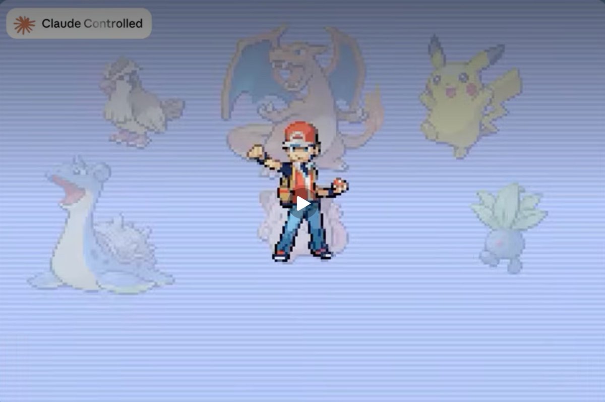
The agent controls the chevron () and destroys the red dots. An authored sprite “,” an emoji “,” and a favicon “each” stay glued to the closing punctuation that follows them.
This image should be transparent in light mode and inverted to be transparent with the background in dark mode.
Sed ut perspiciatis unde omnis iste natus error sit voluptatem accusantium doloremque laudantium, totam rem aperiam, eaque ipsa quae ab illo inventore veritatis et quasi architecto beatae vitae dicta sunt explicabo. Nemo enim ipsam voluptatem quia voluptas sit aspernatur aut odit aut fugit, sed quia consequuntur magni dolores eos qui ratione voluptatem sequi nesciunt. Neque porro quisquam est, qui dolorem ipsum quia dolor sit amet, consectetur, adipisci velit, sed quia non numquam eius modi tempora incidunt ut labore et dolore magnam aliquam quaerat voluptatem. Ut enim ad minima veniam, quis nostrum exercitationem ullam corporis suscipit laboriosam, nisi ut aliquid ex ea commodi consequatur? Quis autem vel eum iure reprehenderit qui in ea voluptate velit esse quam nihil molestiae consequatur, vel illum qui dolorem eum fugiat quo voluptas nulla pariatur?
The caption floats with the image instead of stranding above the following text.
Sed ut perspiciatis unde omnis iste natus error sit voluptatem accusantium doloremque laudantium, totam rem aperiam, eaque ipsa quae ab illo inventore veritatis et quasi architecto beatae vitae dicta sunt explicabo. Nemo enim ipsam voluptatem quia voluptas sit aspernatur aut odit aut fugit, sed quia consequuntur magni dolores eos qui ratione voluptatem sequi nesciunt.
This text is hidden until you click on it. Multiple lines can be hidden Like this!
A spoiler long enough to wrap runs the full width of the column, so its blur reaches both the left and the right margin and has to dissolve into the page at each of them.
The monospace face’s right side bearing swings widely, so a favicon after code ending in a tight glyph keeps the same visual gap as one after a roomy glyph:alex@turntrout.com andnpm i abW andnpm i abT andnpm i abo all sit the same distance from their last glyph.
A mark authored after a link is pulled inside it, so the icon lands after that mark in the surrounding face rather than after the code:npm i abW,npm i abo.
A footnote reference right after a favicon-ending same-page link3 must not wrap onto its own line.
The icon is the same fraction of its text everywhere, so it shrinks inside code and inside a table’s smaller face without any per-context override. Compare GitHub in body text with the same link inside code (github.com) and in the cells below.
Faux-bold text widens glyph ink rightward, so a favicon after a bold link ending in an overhanging glyph, like Compete for Pentagon Favor, keeps the same visual gap, including in a collapsed quote title:
The nato alliance met in the usa. Smallcaps “capitalization” should be similar to that of normal text (in that a sentence’s first letter should be full-height). Here are italicized smallcaps.
Ligatures fi fl ff ffi ffl fj ft st ct th ck
Abcdefghijklmnopqrstuvwxyz
Abcdefghijklmnopqrstuvwxyz
Abcdefghijklmnopqrstuvwxyz
Abcdefghijklmnopqrstuvwxyz
Abcdefghijklmnopqrstuvwxyz
Version labels V1, V2, V100, and V1.0.2 use full-height digits.
This solution is 2/3 water, mixed on 01/01/2024. Even more complicated fractions work: 233/250, 2404210/203, −30/50. He did 1/40th of the job. However, decimal “fractions” (e.g. 3.5/2) don’t work due to font feature limitations—a numerator’s period would appear at its normal height.
Short hyphenated compounds stay whole instead of breaking at the hyphen. The column below is deliberately narrow, so each term is forced onto its own line rather than splitting across two:
We held a 1-on-1 with gpt-4 about the 9-to-5 grind, X-ray goggles, and the mid-1990s.
Inline code ligature kerning:$var must be interpolated into#{$var}. See also===, !==, =>, andcustom-property-no-missing-interpolation.
Inline code left spacing after a crowding glyph: with the help ofTomSmith.
Inline code flush against a glued delimiter: parentheses (code), brackets [code], braces {code}, quotes “code,” a slash AI /code, a hyphen re-code, and equals x=code all hug the code, while a spacethe regex or an em dash—code keeps the small gap.
Favicon after inline code: the icon hugs the code text instead of drifting right of the monospace advance. I pipe the saying intogoosesay (my variant ofcowsay), as also seen atgithub.com/tnalpgge/rank-amateur-cowsay.
const testVar = 5;function loseTheGame(numTimes: number): void { for (let i = 0; i < numTimes; i++) { console.log("You just lost the game!"); }}
This is a plain code block without a language specified.
This block has an intentionally long line so the default soft-wrap has something to chew on: lorem ipsum dolor sit amet, consectetur adipiscing elit, sed do eiusmod tempor incididunt ut labore et dolore magna aliqua, ut enim ad minim veniam, quis nostrud exercitation ullamco laboris nisi ut aliquip ex ea commodo consequat.
This block has short lines.Each line fits easily on screen.No wrapping needed here.
The Elements of Typographic Style (Hartley & Marks, 2004) is a good book.
Parentheses (like these), brackets [like these], and braces {like these} should all be upright.
Bold italic (parentheses) and [brackets]
We need a deep (nesting) test.
Here’s code(not_wrapped) but (these are wrapped).
An upright colon or semicolon after italic text gets a sliver of extra room so the italic’s lean doesn’t crash into it. Compare The Dark Knight : kerned, even after a link like Batman Begins : still kerned; and after semicolons ; too.
Lorem ipsum dolor sit amet, consectetur adipiscing elit, sed do eiusmod tempor incididunt ut labore et dolore magna aliqua. Ut enim ad minim veniam, quis nostrud exercitation ullamco laboris nisi ut aliquip ex ea commodo consequat.
Obama’s first inauguration
January 20, 2009
Lorem ipsum dolor sit amet, consectetur adipiscing elit, sed do eiusmod tempor incididunt ut labore et dolore magna aliqua. Ut enim ad minim veniam, quis nostrud exercitation ullamco laboris nisi ut aliquip ex ea commodo consequat.
Obama’s re-election
November 6, 2012
Lorem ipsum dolor sit amet, consectetur adipiscing elit, sed do eiusmod tempor incididunt ut labore et dolore magna aliqua. Ut enim ad minim veniam, quis nostrud exercitation ullamco laboris nisi ut aliquip ex ea commodo consequat.
Obama’s second inauguration
January 20, 2012
Lorem ipsum dolor sit amet, consectetur adipiscing elit, sed do eiusmod tempor incididunt ut labore et dolore magna aliqua. Ut enim ad minim veniam, quis nostrud exercitation ullamco laboris nisi ut aliquip ex ea commodo consequat.
Obama’s last day in office
January 20, 2017
Lorem ipsum dolor sit amet, consectetur adipiscing elit, sed do eiusmod tempor incididunt ut labore et dolore magna aliqua. Ut enim ad minim veniam, quis nostrud exercitation ullamco laboris nisi ut aliquip ex ea commodo consequat.


 ” is the goose emoji.





 Emphasized “21st.” October 5th, 1993.


 ⤴
⤴